A Tight Turn or a Long Straight: Reading a Course Map
Learn to read a horse racing course map by tracing its bends, straights and joins, so the printed layout becomes a clearer picture of the route.
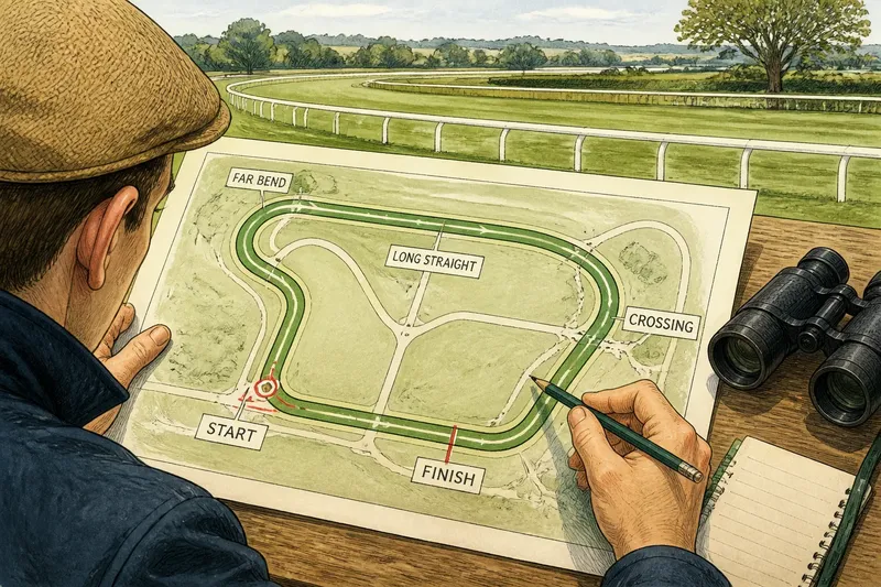
What does a horse racing course map actually tell you about the route a field will take? Start with the bends and straights: their shape and order turn a small printed plan into a picture of where the course curves, opens out and brings runners towards the finish.
A map is a simplified view, not a promise of how a race will unfold. Use it to understand the route and its landmarks, while keeping an eye on labels and direction arrows that explain how the drawing should be read.
1. Find the direction of travel before tracing the route
Before judging a bend, locate any arrows, start labels and finish markings. A loop can look clockwise or anti-clockwise on the page, and the apparent direction may be misleading if the plan is rotated or stylised.
Choose a start point and follow the course line in the indicated direction. If there are several start positions, note which one belongs to the race distance you are interested in. A single map may show alternative starting points or shared sections, so the route is not always a complete lap from one obvious marker.
Imagine a map with a start marker on the lower side and an arrow pointing towards the left-hand bend. Trace that line onwards before looking at the finish. You can then see whether the runners reach the straight after a full circuit, after part of a loop, or by joining a shared section of track.
2. Read a tight turn as a change in direction
A tight turn is a sharply curved part of the outline. On the map, it tells you where the route changes direction over a relatively short stretch of the drawn course. It does not, by itself, tell you how a horse will handle the turn or how quickly the field will take it.
Look at what comes before and after the bend. A sharp curve followed by another change of direction suggests a route with successive bends. A sharp curve that opens into a long straight shows a transition from turning to a more direct run. Those relationships help you picture the course more accurately than treating each corner as an isolated feature.
Also notice whether the map shows an inner and outer line, or a curved section that appears to narrow. The drawing may indicate the general shape, but it may not depict the track’s full width or banking. Avoid inferring precise distances or the amount of room available from a simplified outline.
3. Read a long straight as an extended route segment
A straight is a section where the map’s course line runs without a pronounced curve. It may connect two bends, lead towards the finish, or form part of a longer side of the circuit. Its visual length gives you a sense of the route’s layout, but the plan may not be drawn to scale.
Ask where the straight begins and ends. A straight that starts immediately after a bend is different, as a map feature, from one reached after a gradual curve. Follow the line through to see whether it ends at the finishing point or feeds into another turn. This reveals whether the final approach is itself a straight or part of a continuing loop.
A map can also show a straight that looks short on the page because the whole circuit has been compressed. Treat the outline as a guide to sequence and direction, not a ruler. Where the plan includes distance labels or a scale, use those markings rather than estimating from the printed shape.
4. Compare what a bend and a straight show
Bends and straights answer different questions. A bend shows where the route curves; a straight shows where it runs on without a strong change in direction. Together, they explain the course’s basic rhythm: curve, run, curve again, or perhaps one long turn followed by a direct approach.
Use this comparison to build a verbal route. For example: “The course leaves the start, reaches a tight bend, follows a straight section, then turns again before the finish.” That description is more useful than simply saying that a track looks oval, because it keeps the order of features clear.
Do not use the map’s proportions to predict which horse has an advantage. The plan does not show each runner’s position, pace, or response to the route. Its job here is narrower: to help you understand where the course goes and how its visible sections connect.
5. Trace joins, crossings and shared sections carefully
Some plans show a route that branches, rejoins, or crosses another marked line. These details can matter when a course has different starts or routes for different races. A crossing symbol or separate line should prompt you to check the map’s legend rather than assume that every marked path is used in the same way.
Follow the chosen route through each join. If one line merges into another, note where the shared section begins. If two paths appear to cross, check whether the drawing distinguishes a crossing from a junction. A flat diagram can make these features look alike, while a key or label may clarify their meaning.
For course-specific details, follow the map’s own legend and the information supplied by the course or race organiser. The names and conventions used on plans can differ, so read the labels that belong to the map in front of you.
6. Use landmarks to make the route easier to remember
Once you know the direction, pick a few visual landmarks: the start, the most noticeable bend, a long straight, and the finish. Trace from one to the next instead of trying to memorise every small curve at once. This gives you a simple mental route without turning the map into a set of unsupported claims about race tactics.
Say you are looking at a plan with a start on one side, a sharp turn at the far end, and a straight leading towards the finish. Trace that sequence with a finger, then describe it aloud: “Start, far bend, straight, finish.” The expected result is a clearer picture of where the route runs, even if you cannot yet name every section.
It is not worth spending time measuring the printed curve with a ruler or comparing tiny differences between map drawings. Unless a plan provides a scale and you have a reason to use it, those details can create false precision. The route’s order and direction are usually the more useful things to notice.
What can a course map tell you?
Does a tight turn mean a course is difficult?
The map shows that the route changes direction sharply, but that alone does not establish how challenging the course is for a particular runner. Use the feature to picture the layout, not to rate its difficulty.
Can I tell how long a straight is from its appearance?
Only if the plan gives a scale or dependable distance markings. Otherwise, the drawing may be simplified, so its proportions are best read as visual clues rather than exact measurements.
Why do some maps show more than one route?
A plan may include alternative starts, branches or shared sections used for different routes. Check the labels and key to identify which line applies to the race you are following.
Should I use the map to predict how a race will run?
No: it helps you picture the course, but it does not show the field’s positions or decisions during a race. Keep the map’s role to understanding the route and its features.
Turn the outline into a simple route picture
Reading a horse racing course map is easiest when you work from direction to sequence: find the start and finish, trace the line, then compare the bends with the straights. Notice joins and landmarks as they appear, and let the map’s labels settle any ambiguity. A few well-chosen features can make the route much easier to follow than an attempt to memorise the entire outline.
Keep one question in mind as you look: what comes next on the route? Answering that turns a flat drawing into a useful picture of the course, without asking the map to say more than it can.